
The short version
- VPU (0.09%) and XLU (0.08%) are functionally near-identical at the top of the basket — the holdings overlap is far more important than the 1 bp fee gap.
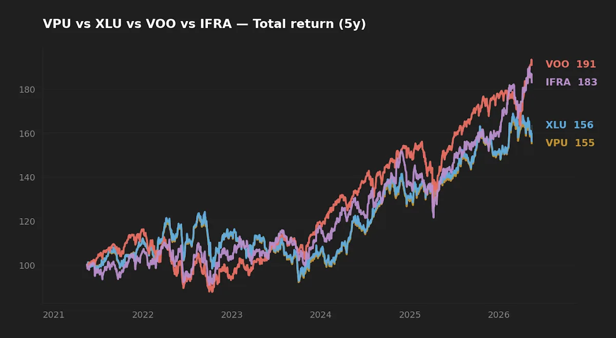
- Five-year realized numbers match almost exactly: 9.0% vs 9.2% CAGR, 17.0% vs 17.3% volatility, -25.1% vs -25.3% max drawdown. The choice is not a return question.
- The real decision is liquidity (XLU, $24.1B AUM, tighter spreads) vs. broader sector reach (VPU's 65-ish names vs XLU's 30-ish). Most long-horizon investors will not notice the difference.
The Vanguard Utilities ETF (VPU) and the Utilities Select Sector SPDR (XLU) are the two default vehicles for U.S. utility-sector exposure. Both are old, cheap, and large. The temptation in any "VPU vs XLU" piece is to score the 1 basis point fee gap as if it settled the question. It does not. After running the rolling numbers, the more interesting story is how closely the two funds track each other despite different index methodologies — and what that says about where the actual decision lever sits.
Why the utilities sector still earns shelf space
Utilities are a slow-growth, rate-sensitive, regulated cash-flow sector. They are a defensive ballast in equity portfolios: long-duration bond-like behavior with equity upside, and dividend yields that historically clear the long Treasury when rates are moderate. With the 10-year Treasury at 4.47% and the Fed funds rate at 3.64% (FRED, as of 2026-05-14 and 2026-04-01 respectively), the case for utilities is less compelling than it was in a zero-rate world — investors can clip a real coupon in Treasurys now — but the sector still functions as a low-beta sleeve and benefits structurally from rising electricity demand tied to data-center and electrification capex.
Both VPU and XLU give you that exposure at near-zero cost. The question is which one, and at what level of margin does that question actually matter.
The fund data
| Metric | VPU | XLU |
|---|---|---|
| Issuer | Vanguard | State Street (SPDR) |
| Index tracked | MSCI US Investable Market Utilities 25/50 | Utilities Select Sector (S&P 500 sub-index) |
| Expense ratio | 0.09% | 0.08% |
| AUM | $11.1B | $24.1B |
| Inception | 2004-04-28 | 1998-12-16 |
| Distribution yield (TTM) | 2.5% | 2.5% |
| 5Y CAGR | 9.0% | 9.2% |
| 10Y CAGR | 9.3% | 9.4% |
| 5Y annualized volatility | 17.0% | 17.3% |
| 5Y max drawdown | -25.1% | -25.3% |
Sources: Vanguard VPU fact sheet; SSGA XLU fact sheet; price/return series via yfinance, pulled 2026-05-17. Macro context from FRED.
The fee gap in compounding terms
A 1 basis point fee differential is the smallest unit anyone publishes. Initially the instinct is to dismiss it as noise. The math, however, deserves to be stated precisely so it is neither overstated nor undersold. On a $100,000 position compounding at 9% gross for 20 years, the terminal-value gap from a 1 bp fee drag is roughly $1,100 — meaningful in absolute dollars, but a rounding error against an ending balance near $560,000. At smaller account sizes the absolute number scales linearly and matters less.
By comparison, the 5-year realized CAGR gap between the two funds is 16 bps (9.16% XLU vs 9.01% VPU), and the 10-year gap is 12 bps. These are larger than the fee gap and run in XLU's direction. Whether that persists is the open question — over a single 5- or 10-year window the difference is well within tracking-error noise for two funds holding overlapping baskets of the same large-cap utilities.
The honest read: the fee gap exists, it slightly favors XLU, and it should not be the deciding variable. Implementation friction (bid-ask spread at trade time, the broker's commission structure, any tax-lot quirks at the position level) will swamp it for most retail investors.
Where the indices actually diverge
XLU tracks the Utilities Select Sector Index, a subset of the S&P 500. That cap-restricts it to roughly 30 large-cap utility names. VPU tracks the MSCI US IMI Utilities 25/50, which extends into mid-cap territory and holds closer to 65 names. On paper, that is a meaningful breadth difference.
In practice, the top of both baskets is dominated by the same names — NextEra, Southern, Duke, Constellation, Sempra, American Electric Power, Dominion, Exelon — and these mega-caps drive most of the return. The mid-cap tail in VPU adds diversification at the margin but is too small a weight to move the index return materially over short windows. That is exactly what the data shows: nearly identical 5-year and 10-year CAGRs, nearly identical realized volatility, nearly identical drawdown profile.
This is the second-order point worth flagging. If you believe the next decade of utility-sector alpha comes from smaller, more agile regional operators capturing distributed generation, demand-response, or local data-center load growth, VPU is structurally better positioned to capture it. If you think the largest grid operators capture the lion's share — likely, given regulatory scale economies — XLU's concentration is not a bug.
Two funds, two index methodologies, and a 5-year CAGR gap of 16 basis points. The decision is not about return — it is about which methodology you would rather own through the next regime change.
Realized risk and the rate-sensitivity factor
Utilities are widely described as defensive, but the 2022 rate-hiking cycle showed how rate-sensitive the sector can be when the long end repriced sharply. Both VPU and XLU drew down roughly 25% from peak inside the 5-year window — comparable to VOO's -24.5% over the same period. That is not bond-like behavior. It is equity behavior with a different factor loading.
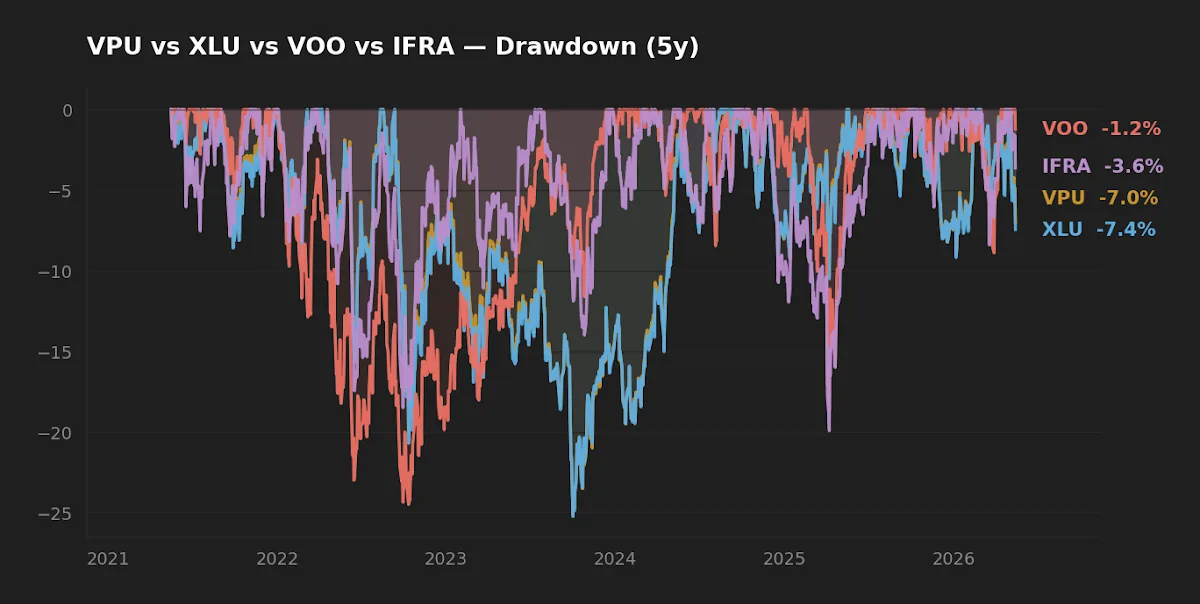
The drawdown chart makes the symmetry obvious. The two funds drew down together, recovered together, and ended the period within tens of basis points of each other. A reader looking for genuine diversification benefit between VPU and XLU will not find it here — both load on the same sector factor and the same rate-duration factor. Picking one over the other does not change your portfolio's risk profile in any practical sense.
What does change it is the surrounding allocation. A utilities sleeve next to a broad-market core (for example VOO at 0.03% expense ratio) acts as a low-beta complement when rates are stable or falling, and as a correlated drag when the long end is rising. Anyone holding utilities for "stability" through a rate shock should look at the 2022 episode and recalibrate that expectation.

Liquidity and scale
XLU is more than twice the size of VPU by AUM ($24.1B vs $11.1B). At those AUM levels, both are well outside any capacity or closure-risk concern. The practical difference shows up in trading: XLU's higher average daily volume and tighter bid-ask spreads make it the default for tactical traders and institutions running options overlays. For a buy-and-hold investor placing one or two orders a year, the spread difference is a few cents per share — meaningful at institutional size, irrelevant at retail size.
Vanguard's structural cost discipline is worth noting on its own. VPU runs at 0.09% with less than half the AUM of XLU at 0.08%. That is not a normal scale relationship. It reflects Vanguard's at-cost model, and it is the same reason VPU's expense ratio has historically dropped over time as Vanguard returns scale economies to shareholders rather than to the management company.
Scenarios where each fund fits
Investor in 30s, 401(k)-only menu, wants a defensive sleeve alongside an S&P 500 core, expects to hold 20+ years: either fund works. If both are offered, lean VPU for the slightly broader index and Vanguard's historical pattern of fee reductions.
Taxable-account investor running covered-call overlays or planning to trade around the position: XLU. Tighter spreads and deeper options-chain liquidity dominate the 1 bp fee disadvantage.
Investor with an existing VOO core who wants more dividend yield without sector-specialist risk: this comparison may be the wrong question. A broad dividend ETF (SCHD, VYM) or a quality-tilted total-market fund typically gives more diversified yield exposure than a single-sector bet.
Scoreboard
| Category | Winner | Margin |
|---|---|---|
| Cost | XLU | 1 bp — effectively a tie |
| Realized 5Y return | XLU | 16 bps — inside noise |
| Realized risk | Tie | Vol and drawdown within 30 bps |
| Liquidity | XLU | ~2.2× AUM, tighter spreads |
| Breadth / future-proofing | VPU | ~65 vs ~30 holdings, mid-cap reach |
| Issuer cost trajectory | VPU | Vanguard's historical pattern |
FAQ
Q: Is the 0.01% fee gap actually worth thinking about?
On a 20-year horizon at a $100k position and 9% gross, the fee gap costs roughly $1,100 in terminal value. Real, but smaller than the spread difference, smaller than the realized CAGR gap, and far smaller than the rebalancing-discipline decision.
Q: Why not just hold both?
The two funds overlap heavily at the top of the basket. Holding both gives you no diversification benefit and adds tracking complexity. Pick one.
Q: How does this compare to broader infrastructure ETFs like IFRA?
IFRA (iShares U.S. Infrastructure ETF, 0.30% expense ratio, $4.1B AUM) is a different exposure — it leans toward industrials and materials with smaller utility weight. Its 5Y CAGR of 12.8% reflects that different factor mix, not better utility selection. See VOO vs XLU vs IFRA for the head-to-head.
Q: Should I tilt a long-term core toward utilities at all?
A broad-market index already includes utilities at sector weight (~2–3%). Holding VPU or XLU is an active overweight. That decision should be deliberate and tied to a thesis about rate paths or sector-specific demand growth, not a vague "stability" rationale. The First $10,000 covers how to think about that core/satellite split.
Q: What about dividend treatment for taxable accounts?
Utility distributions are predominantly qualified dividends, taxed at long-term capital-gains rates for U.S. investors meeting the holding-period requirement. This is favorable relative to ordinary-income REIT distributions but does not change between VPU and XLU.
What this comparison can and can't tell you
It can tell you the two funds have produced almost identical risk and return over the available 5- and 10-year windows, that their fee differential is trivially small, and that their holdings overlap is high enough to make the choice low-stakes. It cannot tell you how either fund will behave in a sustained rising-rate regime longer than the 2022 episode, whether utility sector capex tied to AI-driven load growth will accrue mostly to the mega-cap names XLU holds or extend to the mid-cap tail VPU captures, or whether the next decade's sector return will look anything like the last decade's 9% annualized.
Editor's read
If forced to pick one for a long-horizon utility sleeve, the editor leans VPU on two grounds: the broader index gives a slightly better chance of capturing whatever mid-cap utility names benefit disproportionately from electrification capex over the next decade, and Vanguard's at-cost structure has historically compressed its expense ratios further as assets scale. Neither argument is strong enough to call this a clear win — for an investor who values execution liquidity over methodology breadth, XLU is the rational pick. The decision matters far less than the rebalancing discipline applied to whichever one is held.
Disclosure: The editor does not hold either fund at the time of writing.
Methodology
Price and return series pulled from yfinance on 2026-05-17. Expense ratio, AUM, distribution yield, and inception date sourced from the issuer fact sheets (Vanguard for VPU, SSGA for XLU) as of the same date. CAGR computed from adjusted-close total-return series over rolling 5- and 10-year windows. Volatility is annualized standard deviation of daily log returns over the 5-year window. Maximum drawdown is peak-to-trough on cumulative total return over the 5-year window. Macro context (10-year Treasury yield, Fed funds rate, VIX, CPI year-over-year) from FRED, with as-of dates as cited inline. All figures rounded for readability; raw values retained in the source dataset.
This article is for educational purposes and does not constitute personalized financial advice. See full Disclaimer.